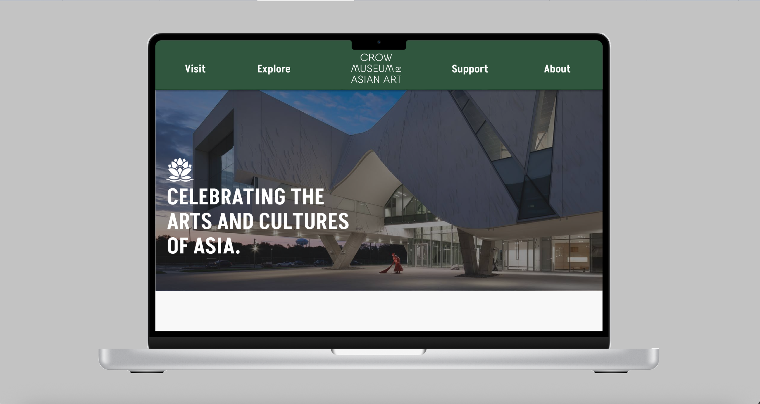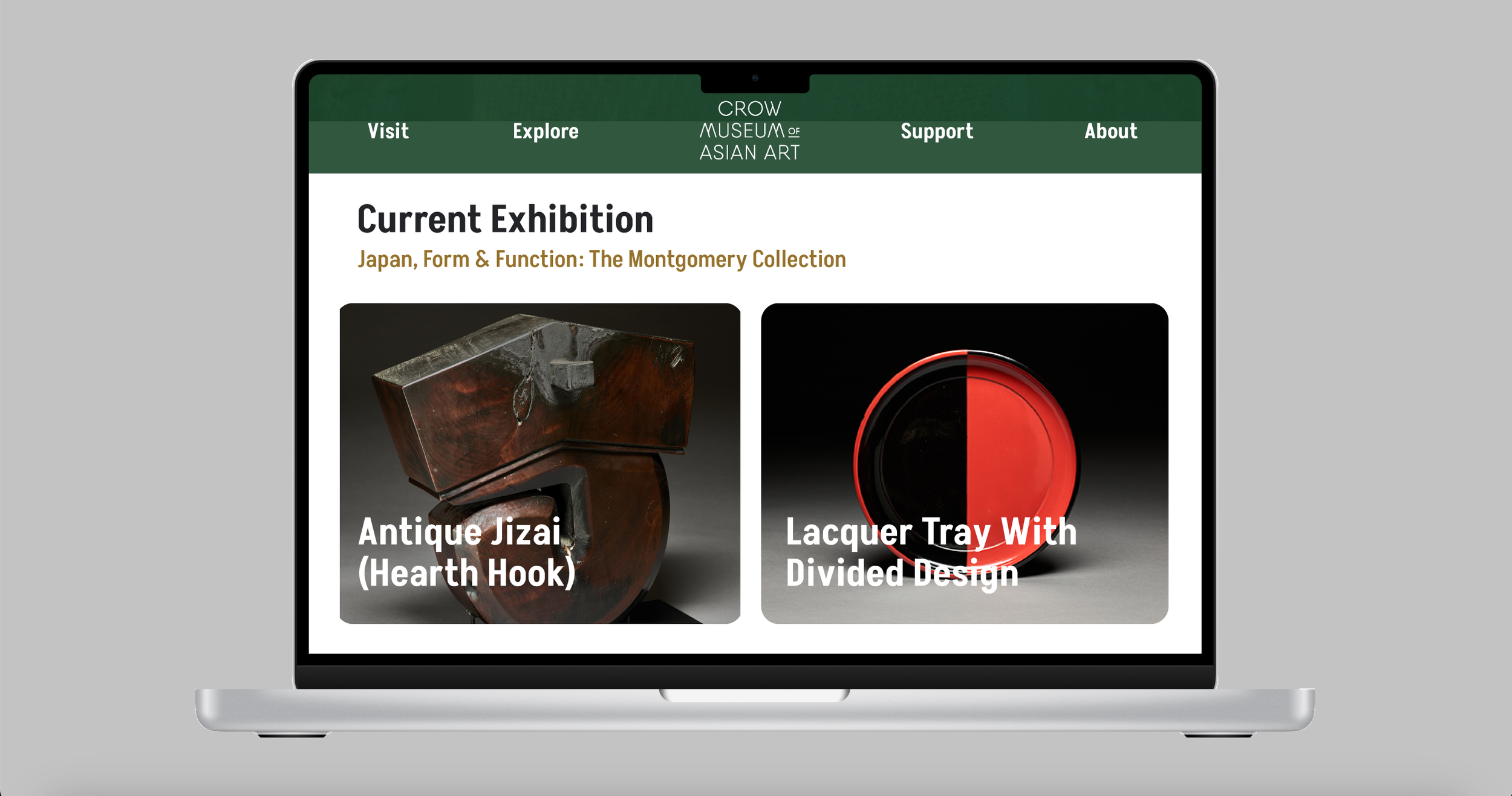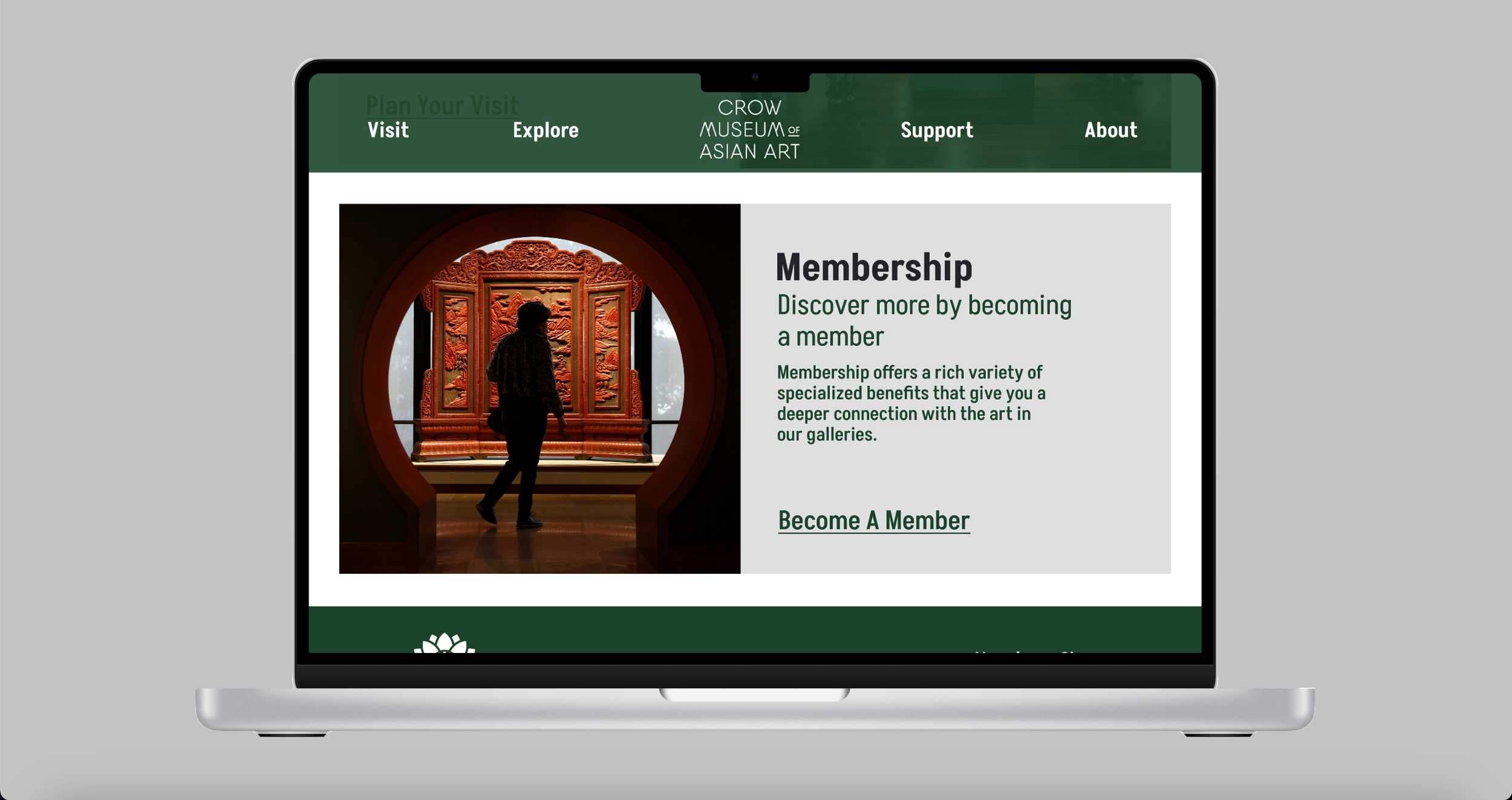
Crow Museum
UX/UI
ROLE: UX/UI Designer
TOOLS: Figma
DURATION: 2 Weeks
The Crow Museum of Asian Art of The University of Texas at Dallas inspires and promotes learning about the arts and cultures of Asia through exhibitions, research and preservation of timeless collections. This website homepage redesign case study will focus on the research, design process and reorganization of the Crow Museum’s website homepage.
THE CHALLENGE
Redesign the Crow Museum homepage in order to make a more cohesive and engaging homepage that allows user to get a better understanding of what the museum has to offer.
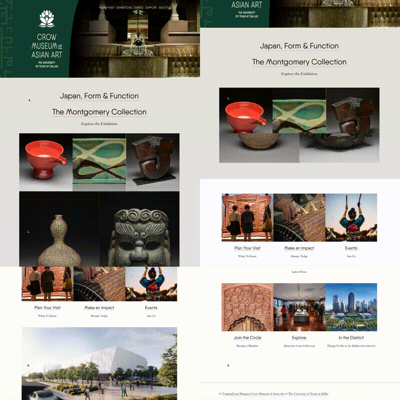
Original Website Homepage
ADDITIONAL INFORMATION
The museum only holds one exhibit that rotates throughout the year.
For this challenge, I was given creative freedom on how I’ll redesign the homepage but I was required to keep the information displayed on the website accurate.
THE DESIGN PROCESS
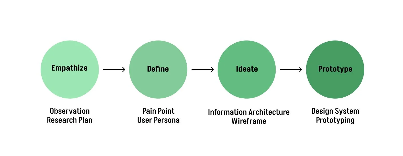
I utilized a few steps from the Design Thinking Process.

While interacting with the current museum website, I made note of certain parts of the website that could potentially be improved or that can be updated in order to create a cohesive layout.
STAGE 1 - EMPATHIZE
USER INTERVIEWS
5 users were interviewed in order to get an idea of what needs to be worked. Here are the questions that each user was asked:
Have you ever visited a museum before?
How was your experience when scrolling through the Crow Museum homepage?
Were you able to get all the information you needed just from the homepage?
Would you visit the museum?
Interview Results
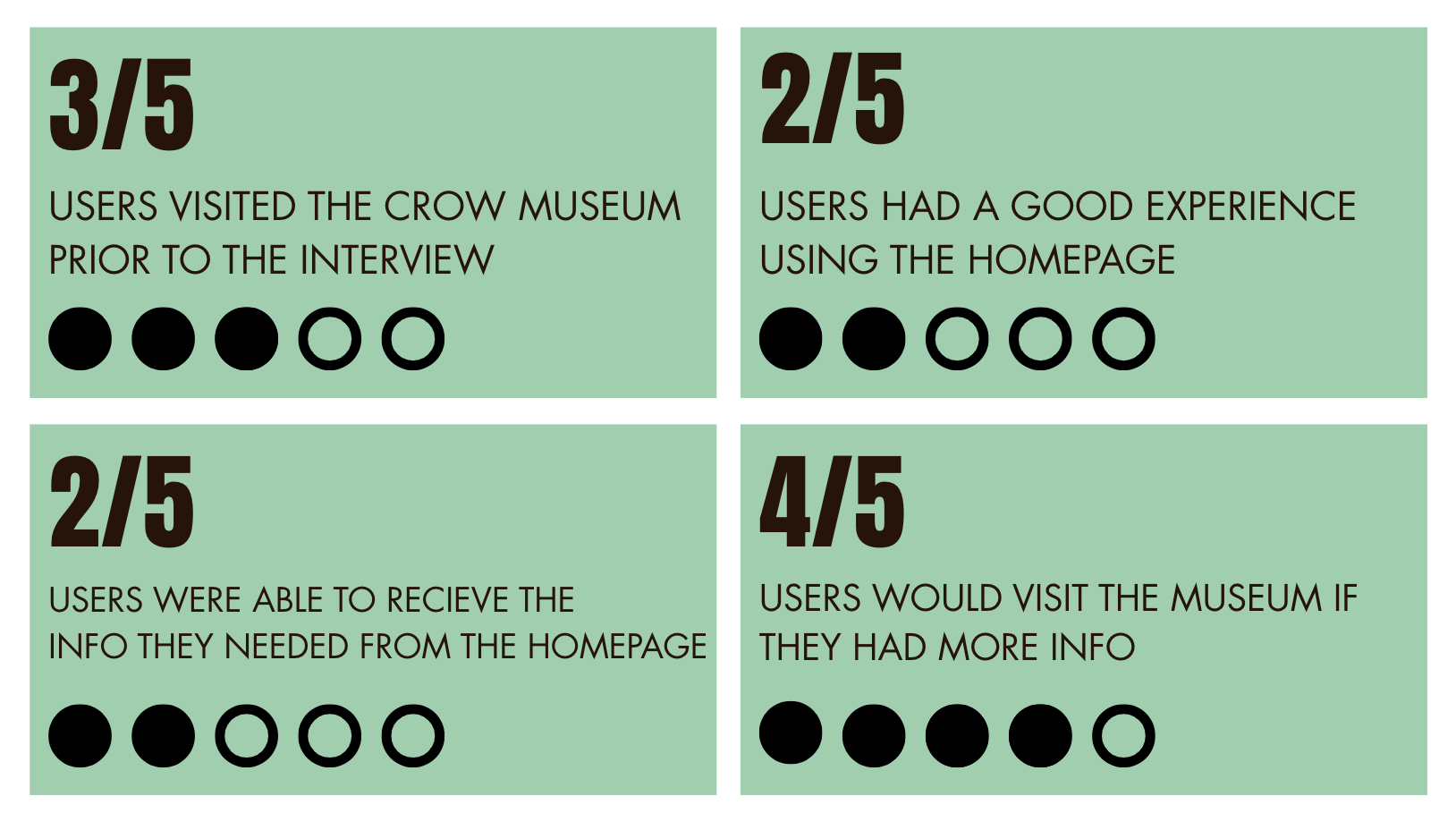
OBJECTIVE FOR REDESIGN
Find out users behavior when scrolling through homepage.
Find pain points users face.
Find a way to make website layout consistent.
After analyzing the homepage and hearing responses from users who visited the website, these are the objectives that were determined:
STAGE 2 - DEFINE

The next step I did was to create a User Persona. User personas are needed to describe potential users based on the research that has been done.
USER JOURNEY
Through the user journey map, I can find out how users behave when they scroll through the homepage.

PRIORITIZATION MATRIX
I created a priority matrix to consider what I will implement into the design improvements.

I made an Information Architecture chart in order to ensure users can find the information they need and navigate between screens with minimal effort.
STAGE 3 - IDEATE

WIREFRAMES
I created low-fidelity wireframes using Figma, based on the information architecture.


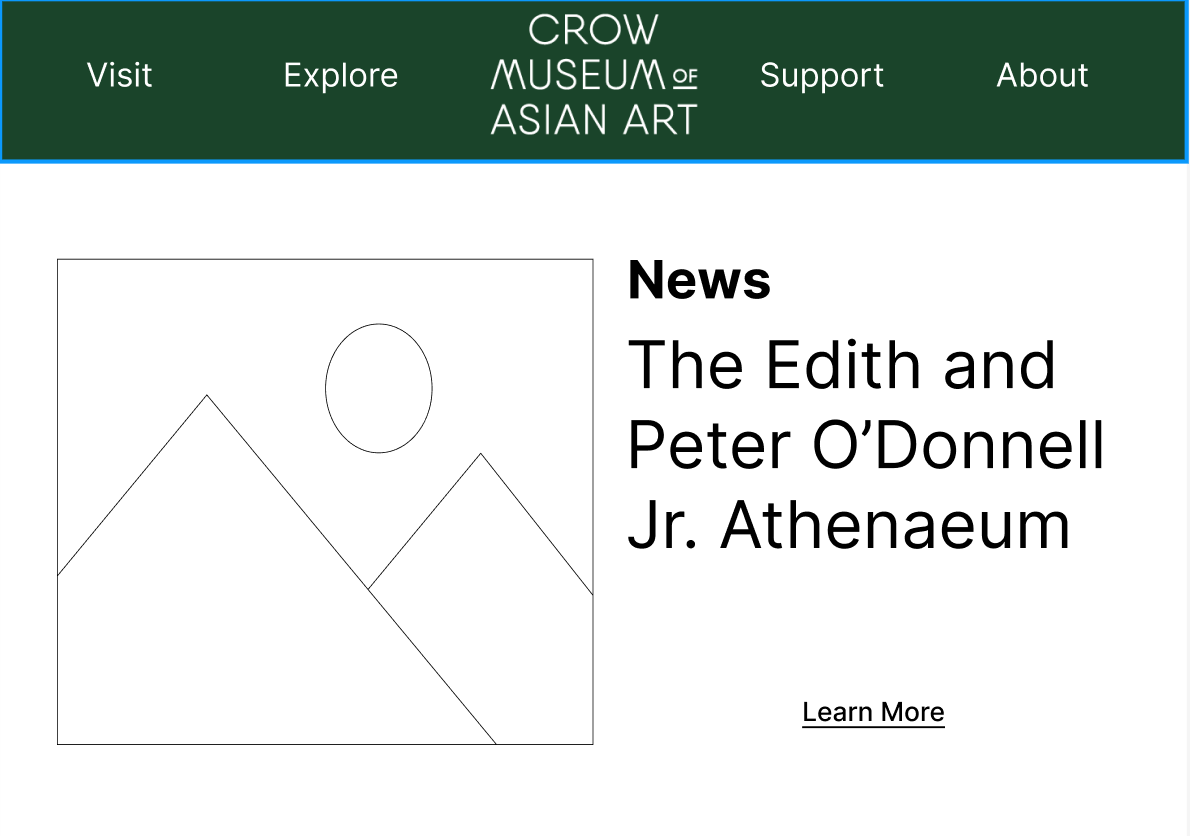

I decided to keep the green they used since it provided an elegant feel to the overall homepage. To maintain that elegance, I included a gold color as the secondary color for the typeface.
COLOR PALETTE
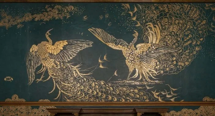
Color Palette Inspiration
(The Story of the Room By James McNeill Whistler)
GOLD
#967227
GRAY
#E7E7E7
#1A4428
GREEN
FONT
The Akshar font felt more legible compare to the thin fonts used on the old homepage. The typeface was also designed by an Asian typeface designer which fits well with the museum’s goal since they strive to support Asian artists and designers.

STAGE 4 - PROTOTYPE
Before I prototyped, I selected the colors and new typeface that I’ll be using for the new website.
INTERACTION DECISION
The carousel not only allowed the gallery images to be more consistent, it also provided an interactive feature to the homepage.
FINAL DESIGN
After making all of the final edits, here is the final prototype of the redesigned homepage.
FINAL PROTOTYPE DEMO
Overall, I learned a lot when it came to the redesign process of a website homepage and I’m glad I was able to implement a majority of the users needs in the final design. My next goal is redesign the entire website and see what else I can update based on the research I collected.

